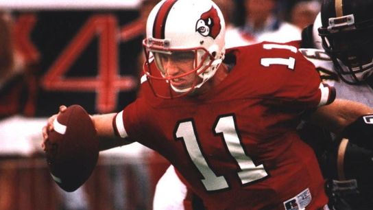
It's a tale as old as time: New staff, new uniforms. Or a new mascot. Or, in Louisville's case, a new field design.
As we established long ago, a team's aesthetic portfolio is an unspoken statement about how it feels about itself, more specifically when and how that portfolio responds to changes made on the field.
In Louisville's case, the program is welcoming back native son Jeff Brohm. The Prince of Louisville football, Brohm is the son of former Louisville quarterback Oscar Brohm, who later became a prominent Louisville high school coach. Jeff Brohm starred at powerhouse Louisville Trinity High School, then joined the Cardinals in 1990. A team MVP as a junior and a senior, Brohm played eight seasons professionally, then got into coaching -- as the head coach of the arena league's Louisville Fire.
He joined the U of L staff in 2003, as the quarterbacks coach. His most successful pupil happened to be his younger brother Brian, and in 2006 the pair helped lead the Cardinals to the most successful season in school history -- a 12-1 record, a Big East championship, an Orange Bowl triumph over ACC champion Wake Forest, and a school-record No. 6 AP final ranking. Looking backward, one can say Louisville's path to ACC membership began that season.
Brohm left town after the 2008 season, beginning his own version of the Hero's Journey, a trek that saw him win 66 games at Western Kentucky and Purdue, before finally returning home last winter.
In hiring Brohm, Louisville is hoping to throw it back to The Good Old Days, and the new field design at L&N Federal Credit Union Stadium will drive that point home.
We'll stop stiff-arming you now...
— Louisville Football (@LouisvilleFB) May 1, 2023
We're going back to our roots 🤝#GoCards pic.twitter.com/Kvb1ktkC4i
The stiff-arming Cardinal was Louisville's secondary logo from 1981-2000, according to SportsLogos.net, before it was replaced by a hybrid logo of the Cardinal head making an L shape. (If that sounds nonsensical, you're not wrong. The school replaced it with a simple Cardinal head in 2013.)
The Cardinal head logo has remained a constant since 1980ish, but the uniforms around that iconic logo have adapted with modern times -- for better or worse. For example, here's how the team dressed for their 34-10 win over James Madison back in November.
... Yeah. Not good. That template will look especially out of place with the retro midfield logo and the classic end zone typography, and so here's hoping this is merely the precursor for an overall rebrand, if and when Brohm gets the good times rolling once again.
