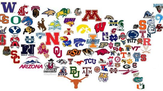
A few moments ago, @CloydRivers tweeted out this interesting graphic depicting The United States of College Football.
Looks pretty cool at first glance right? I thought the same things, so I retweeted it, and nearly 1,700 other people have done the same. But then I started to notice a few things that don't seem quite right.
Here are my 10 initial observations from the graphic:
- The geography of the Michigan programs is all wrong. Michigan and Michigan State should trade places on the map and so should Central Michigan and Western.
- Really clever use of the Florida State and Texas logos on the map.
- No love for Colorado State? They did win 10 games last year...
- Of the eight FBS programs in the Buckeye State, Ohio State is a no brainer, but why Ohio U over Cincinnati, or Toledo, or any of the others?
- Could Vanderbilt's logo be any smaller?
- Why not include the absolutely dominant small college programs like Wisconsin-Whitewater (D-III), or Mount Union (D-III)?
- Why are the logos for Minnesota, Arizona, Nebraska, Illinois, Texas and Washington so much bigger than everyone elses?
- Houston got the shaft too! But hey, UTEP is included..and don't try to tell me geography was part of the selection process because UNI is basically in Canada.
- Who is the Indian head logo in between Minnesota and North Dakota State? That spot could easily belong to Utah..another program that got snubbed.
- Instead of some of those FCS programs in the great plains area, the Bison logo from NDSU should be disproportionately larger to properly illustrate their dominance of the FCS ranks.
- Hey Hawaii, since you're not part of the continental US, I guess you can't be a part of this graphic. Tough luck.
