Opportunity: In 2022 and 2023, the Big Ten had the chance to add four well-respected academic institutions, located in valuable media markets, all with iconic brands, devoted followings, and illustrious histories of success in athletics, especially in football.
Problem: Those universities are not located anywhere near the existing 14 institutions.
We obviously know the Big Ten decided the opportunity was bigger than its problem and added the Pac-12's four most valuable brands -- a death blow to its century-long peer and partner -- and how the conference has attempted to navigate this big, omnipresent and unsolvable problem in real time has been a fascinating watch.
How can a conference make an 18-team roster work? And is all the money in the world worth it if you have to go touch the Atlantic Ocean, the Pacific Ocean and points in between to earn it?
We saw the latest evidence of the conference trying to wrap its arms around itself on Friday.
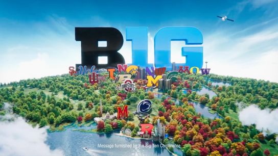
USC, UCLA, Oregon and Washington officially became the Big Ten's 15th, 16th, 17th and 18th members on Friday, and in accordance BTN released the updated version of its beloved "Maps" PSA. If you've watched a Big Ten game on television at any point in the last decade, you've seen it.
Here's the original version, released nine years ago.
As you see, the ad actually begins at the Rose Bowl, then jumps straight to the Rocky Mountains, and then pretends Nebraska lies just on the other side -- as if Uncle Rico could toss a pigskin from Nebraska's Memorial Stadium and have it land at the Rose Bowl.
The ad's creators asked viewers to gloss over that bit of geographic license, because accuracy wasn't the point. Once we get to Nebraska, we see how contiguous 11 of the Big Ten's 14 were. Sure, Penn State was a bit removed, sitting on the other side of the Allegheny Mountains from its closest neighbor Ohio State. But the B1G had made it work for nearly a quarter century at that point, and while Maryland and Rutgers weren't close to the "original" Big Ten, at least they were close to Penn State.
But as we briskly make our way from Nebraska to Ohio, "Maps" highlighted how much this conference shares -- an underlying history, made possible by proximity.
Now let's watch the new version of "Maps," released Friday.
We know you’ve been waiting for this one…
— Big Ten Conference (@bigten) August 2, 2024
“Maps” is here and it’s beautiful. #B1GWelcome pic.twitter.com/vPfVeEdonn
Hits different now, doesn't it?
The Rose Bowl is gone, and instead we start on the other side of the Cascade Mountains, north of Seattle. Moving down the West Coast is easy enough -- LA sure seems exciting!! -- and then we skip over the Rockies to Nebraska.
To my eye, "Maps" actually moves Nebraska to a geographically accurate place on the map, much further than a stone's throw from the Rockies. Except if you blink, you'll miss it. "Maps" would have you believe the 1,500-odd miles between Lincoln and LA -- 21 hours and change by car, according to Google Maps -- aren't even really there. Just don't think about them and they'll go away. Pretend you don't notice, please.
We all know that's not true. Seven billion dollars in TV money aren't going to make Piscataway and Eugene any closer together, and there's nothing anyone can do to change that. "Maps" knows this, but what can the ad makers and the conference behind them really do? Once we get to Lincoln, we're off to Iowa City, then to the Great Lakes, and before we know we're on the other side of the Alleghenies, and now London is just on the other side of the pond.
As the camera turns around and zooms out, we see all 18 logos, strategically placed to where Washington's "W" occupies just as many pixels on the frame as the Illinois "I' and the Maryland "M."
Lording over them like gods is the conference's own logo, and that's where we get to the most accurate portrayal of the ad, physically and metaphorically. This conference is BIG.
