Well, folks, it's April 4 and we've finally had our first honest to goodness uniform reveal of 2018. The Titans spent Wednesday night unveiling the franchise's first comprehensive overhaul since moving to Tennessee and taking on the Titans identity in 1999. The team's colors -- dark blue, light blue and red, an homage to the Houston Oilers -- are a dangerous combination. When the club mixed all the colors together well -- basically, the right amounts of both blues -- it worked.
Other times the colors worked against each other to create a monstrosity.
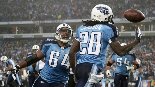
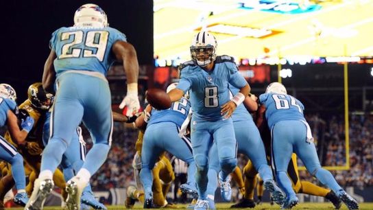
The real problem was the logo. I mean, what is it? A disc with a prehistoric looking T and... flames? Why are there flames? You're not the Calgary Flames or the Miami Heat. What purpose do the flames serve?
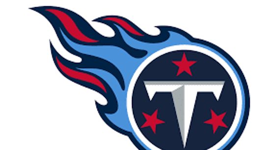
So Wednesday night was a chance for a clean start. A fresh slate. All the cliches. And they came up with.... this.
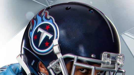
Yep, it's the exact same logo on a blue helmet.

Oh dear heavens. That's too much dark blue. Way too much dark blue.

This particular look is a monstrosity. The ingredients aren't working in concert here. It's the exact opposite.
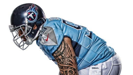
Adding gray would have been a nice choice, but the amount Nike added makes you wonder why it's here in the first place. Look at the uniform on the right here. It's a light blue jersey with light gray and dark grayshoulder yokes underneath a dark blue helmet and paired with white pants. Does anyone mix five colors together and do it well?

The Titans' comprehensive uniform overhaul needs its own comprehensive overhaul.
