Ever since reading Jeremy Darlow's book Brands Win Championships where he highlights the about the importance of branding for programs and businesses I've grown to have a new appreciation for programs and people that understand branding and how it can impact how a community and team are viewed, and how it can ultimately play into their success.
Some college programs clearly do it better than others. Oregon's "O" is a signature. Texas' Longhorn and Miami's "U" certainly fit the bill as well.
Think about it. When you see just a simple outline of the Eiffel tower, you immediately recognize it. The same goes for Disney's Mickey Mouse outline, McDonald's golden arches, the Nike swoosh, or an apple with a bite taken out it. With companies that really understand the importance of branding like those companies do, there is absolutely no mistaking whose logo each of those belong to.
But when we start to think about branding at the high school level, where some programs do an outstanding job of it, while others gravitate to what is convenient.
According to highschoolmascots.com, which claims to have a tally on the national and state-by-state totals for each mascot used in high school athletics, the following are the most used mascot names:
- Eagles (1,273)
- Tigers (881)
- Panthers (809)
- Bulldogs (806)
- Wildcats (669)
Now, it's important to point out the difference between mascots and logos. A mascot is a person, animal, or object used to represent a group with a common public identity, in this case a school, while logos are what are put on the side of helmets, jerseys, coaches polos and school letterhead.
With nearly 4,500 schools sharing those five mascots alone, there's bound to be some overlap of schools simply choosing the same generic logo.
I'm not suggesting that every high school can hire someone to create their own new logo. For a lot of programs, their logo tells a story of their rich history and tradition. But for others, somewhere along the line, someone decided to take the easy way out and went with something generic...and for better or worse, it stuck. To change it would mean allocating critical resources to changing things like the school's letterhead, signage, logo at midfield of your football stadium and midcourt of your basketball floor, as well as a whole bunch of other things.
Last week, I sent out a tweet about the most generic logos out there, and got some great feedback. A lot of these, but not all of them, end up making their way onto helmets. Here's the list I came up with, along with pointing out some programs that have found a way to put their own unique spin on the overused logo to make it their own.
A lot of these may differ based on the region you're in. If there's something you see a ton of not on the list, fill me in via Twitter @CoachSamz or via email at doug@footballscoop.com.
1) BLOCK LETTERS
The most generic and unimaginative of all the logo options out there are simple block letters. Every one of us knows a program that uses this method as their primary logo option, and many of us have, or are currently coaching at a school that uses this.
Also included: interlocking block letters (think the "SC" for USC)
2) THE PAW PRINT
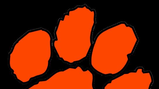
Lions, Tigers, Bears, Wildcats, Panthers, Bulldogs...all of them could (and have) used the simple paw print logo that is probably most recognizable as what Clemson uses. But there are hundreds of variations out there that follow the same basic Clemson-like outline. Some add claws (often Bears and Wildcats), while others often look more cartoon-ish and in every color under the rainbow. Wear this logo to your local coaching clinic, and chances are really good no one is going to recognize what school you're with.
A program who has put their own spin on it:
There are some really cool and creative ways out there to make this stock design kind of unique, as Wellsville HS (OH) does with their variation.
3) THE "SCREAMING" EAGLE
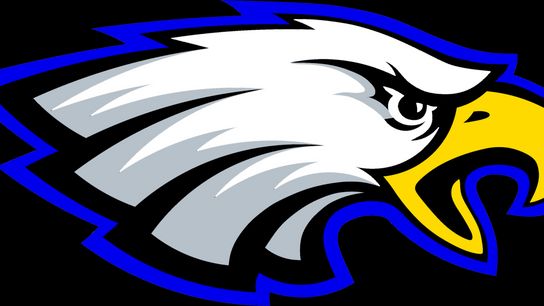
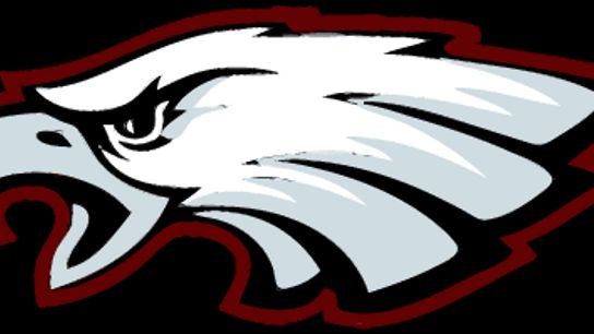
Eagles, Falcons, Hawks...a lot of them all fall into this trap. Like the paw print, there are a lot of variations of this mascot being used, facing either direction. It has become the standard go-to bird logo with a few color swaps to make it a school's own.
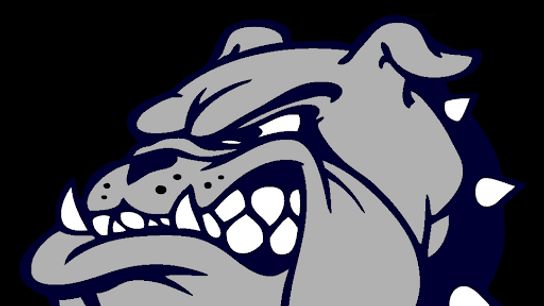

4) THE "SNARLING" BULLDOG
Like the Paw Print and Eagle logos, the stock Bulldog logo often gets the same "let's just change the color" or the way it's facing treatment. There are also a lot of variations to the snarl, but the overall template remains the same. Coaching at a school who has used a similar Bulldogs mascot previously, it became very apparent to me just how popular this one is for high schools around the country.
A program who has put their own spin on it:
A few programs have done a really nice job coming up with something different with the ever-popular Bulldog mascot, including Georgia who underwent a big rebranding a few years ago and settled on a well done 2-D version as their secondary logo to the Circle G that has quickly become widely copied as well.
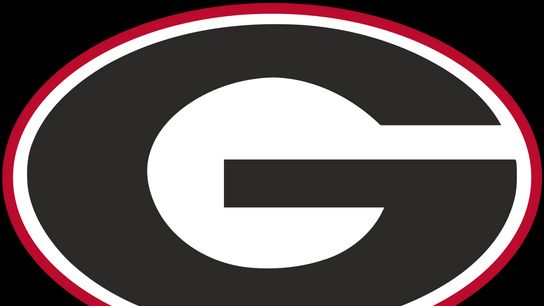

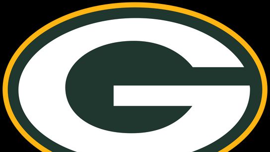
5) THE "CIRCLE G" USED BY GREEN BAY / GEORGIA / GRAMBLING STATE
Whether you picture Georgia, Grambling State or Green Bay's logo, that's the template we're talking about here. We've all seen the programs that replace that "G" with a "L" or "S" or "H" and put their own colors on it to try and make it their own.
6) COPYING A TRADEMARKED NFL / COLLEGE LOGO
This category is for the schools out there that just copy a logo used by an NFL or college team. The biggest culprits of this approach are team mascots using a Cardinal or the Patriots, Vikings, Spartans, Yellow Jackets, or Blue Devils. This also includes schools whose initials match a place like Southern Cal with the interlocking SC in different colors.
Just missed the cut, but deserve mentioning: The Florida State spear on the side of a helmet, programs in Texas putting their logo with the Texas outline behind it, the "wing" pattern on each side of the helmet popularized by Oregon.
Personal Note: Perhaps the only thing more frustrating than a school that uses a generic logo is one that has no direction and uses a different logos in everything that the school puts out, or every T-shirt made. To me, that sends a message that people can't get on the same page about something really simple, and that's not a good sign for people uniting and coming together when things get a bit more complicated.
