Teams tweaking their uniforms in the name of veterans, or military appreciation, or just sheer patriotism has been quite the craze the past few seasons.
As is the case every time that a program releases a new alternate uniform, there are hits, and there are misses among fan bases. So with Veterans Day upon us, I decided to take an unbiased look back and rank the top 5 patriotic inspired uniforms of the past decade.
Trust me, it's easier said than done.
Here's what I came up with, starting with #5 and working my way down to #1. Three of the selections came courtesy of Under Amour and two came via Nike, and I included a fun bonus "What were they thinking?" category at the end.
Enjoy
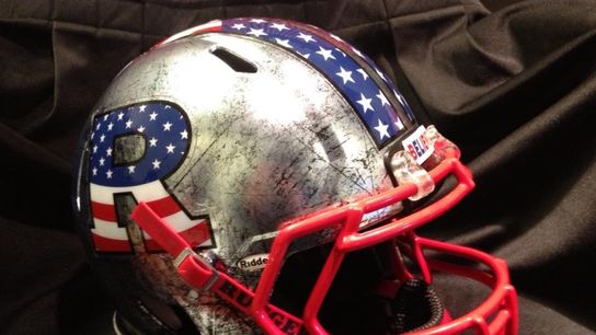
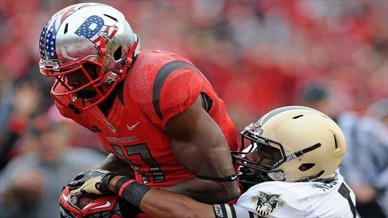
5) Rutgers 2012
These helmets just scream "Civil War era" to me. The worn silver look was a really nice touch because just throwing red, white, and blue in the logo doesn't do anything for anyone.
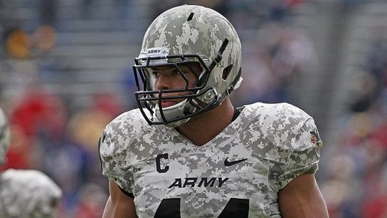
4) Army 2008
Army debuted these digital camo uniforms back in 2008, and I remember seeing them at the AFCA national convention at the Nike booth at the exhibition center and admiring it for a few minutes. This list wouldn't be complete without a uniform from a branch of the military, and this one is more than deserving.
3) Texas Tech 2013
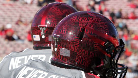
Texas Tech earned my #3 spot with these Wounded Warrior / Lone Survivor uniform alternates that hit the field in 2013. The bold detail that went into these, and the "Never Quit" wording that can be found integrated throughout the helmet, uniform and even the cleats looks really cool.
2) Northwestern 2013
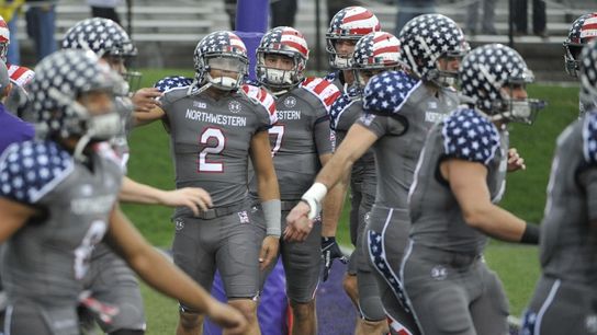
Back when the norm for programs to honor the military was to swap out their team colors for the red, white and blue, Northwestern decided to blow up the mold and start their own thing with these. I was a big fan when they were first released, and I remain a big fan of them now.
1) Maryland 2014
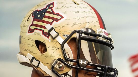
One of Maryland's most recent alternate uniform/helmet additions (made to honor the 200th anniversary of the Battle of Baltimore), also happens to be my top ranked military uniform of the past decade. for a couple reasons.
First of all, it doesn't get any more patriotic than incorporating the lyrics to The Star-Spangled Banner into your uniform, so points for that right off the bat.
Then you've also got what looks to be the outline of a Terrapin on the helmet - but not so fast - that's actually the outline of Fort McHenry, which also happens to be the site where Francis Scott Key, the author of the Star Spangled-Banner, saw the actual "rockets red glare, and bombs bursting in air" that inspired our national anthem.
How could any other uniform hold the top spot after finding a way to use that kind fo detail?
If you feel like one of your favorites was omitted, make your argument in the comments below, or hit me @CoachSamz on Twitter.
Bonus: What were they thinking?
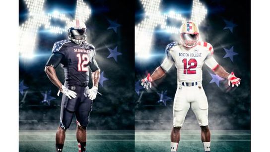
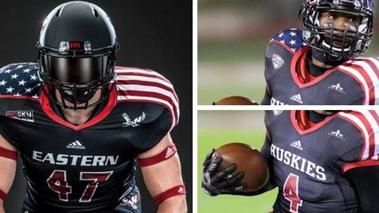
Northern Illinois, Eastern Washington, Boston College, Hawaii (and numerous other programs) used this same cookie-cutter look.
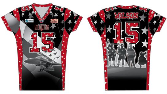
Then there was this one from the Jacksonville Sharks of the Arena League
