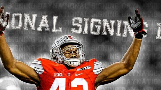
To coaches, national signing day is better than Christmas morning is to a small child who still believes in Santa Claus.
It's the culmination of weeks, months, and sometimes even years of hard work, hours on the road away from family, and thousands and thousands of fast food calories, all for a piece of paper with a signature that starts a journey of a lifetime for lucky recruits everywhere.
With that said, there have been a number of programs that have rolled out some really nice graphics to announce their latest additions this morning. A lot of them have been pretty run-of-the-mill, and I admit that some have left me scratching my head, but the list above is for all the program's whose graphics are a cut above the rest.
As more graphics hit social media, I'll update this article accordingly.
Northwestern
With the signing class now full, this announcement of the 2015 class from Northwestern is solid.
Ole Miss Nice and clean graphic here from the Rebels. I really like the way they've incorporated the rankings into the graphic. While other programs are including the names of the primary recruiters, Ole Miss is the only program I've seen to include pictures.
Alabama
Alabama's recruiting graph is exactly what you'd expect from a program run by Nick Saban; precise and classy.
Colorado State
Strictly from a graphics perspective, Colorado State's may be the best of the bunch with the player emerging from his home state. It would be interesting to see what they'd do if they picked up a guy from a small state like Rhode Island.
Oklahoma State There is no mistaking where this one is from, all the way down to the orange hue. I've seen a few different programs go the small graphic route (see the hammer below) to explain the tools that the recruit is bringing to the table, but OK State is doing it better than anyone else at the moment, in my opinion.
Penn State
This graphic from Penn State is very clean cut and appealing to the eyes, lists all the relevant information that you need to know on the recruit, and also (more importantly in my opinion) is it gives a nice little tip of the cap to the player's high school coach. Nicely played James Franklin.
Auburn Auburn's graphic is just fantastic from top to bottom. They've got their own NSD15 graphic, the players name is big and bold, and the signature font is a nice touch.
USC
Southern Cal's may be my personal favorite of the entire bunch. It's got good branding, the stars of the recruit, and includes a quote from coach Sark on the prospect and what the staff likes about him and what he brings to the table.
Baylor Baylor may have opted for the hippest look of the bunch, and while I really enjoy it for the most part, I think including an actual picture of the player would have made this one top tier material.
Michigan State
It may seem like something small, but there's just something about a high school player seeing his name on the back of the jersey of a program he just committed to spending his next four (or five) years at. I really like this one from Dantonio and his staff.
Cincinnati The Bearcats went with the futuristic approach, and while I think the fingerprint down in the lower right is a bit strange, I think the rest of the graphic is very clean and well executed. This is another program that highlights the primary recruiter on the graphic, which is really nice to see.
Notre Dame
Does any program brand themselves better than the Fighting Irish? On this one graphic you can count four Notre Dame related logos and two Under Armour logos. Not only do the Irish have one of the most appealing graphics of signing day, but I'd also like to award them with the best hashtag of the day as well with their use of #ShamrockSoldiers2015.
Purdue The Boilermakers may not be pulling in a top 25 class when it's all said and done, but they do have one of the nice graphics to announce their commits. The black and gold scheme looks classy, and I also like how they've included the players' Twitter handles and what member of the staff was the primary recruiter.
Michigan
Michigan made this list last year with an interactive piece, and did a really nice job with this year's new-age type graphic for their announcements.
Mercer The only FCS program to make the list so far, Mercer's graphic has a lot of information in a small area, but it all comes together quite nicely. Very well done.
Tulane T
ulane's graphics certainly deserve some attention for their creativity alone. These are smooth.
