I've noticed a flaw in how we rate uniforms in college football. Too often we conflate the quality of the uniform with the ability of the players wearing it. Too often we conflate longevity with excellence. If your program never changes its uniform, and it wins far more often than it loses, then you're guaranteed to top the variousrankings despite the actual quality of the uniform.
It's time to separate the over-celebrated from the over-looked. That's not to say these are the 11 best uniforms in college football -- though many here would have my vote -- but to simply to remind you, beloved reader, of the most under-appreciated uniforms in college football.
1. Cal
Cal will tell you their colors are blue and gold but, c'mon, this is yellow. And there's nothing to be ashamed about in wearing yellow. In fact, yellow may be the perfect sports color. Nothing else combines the bold aggression of red with the distinguished regality of gold like a bright, unabashed yellow.
2. BYU
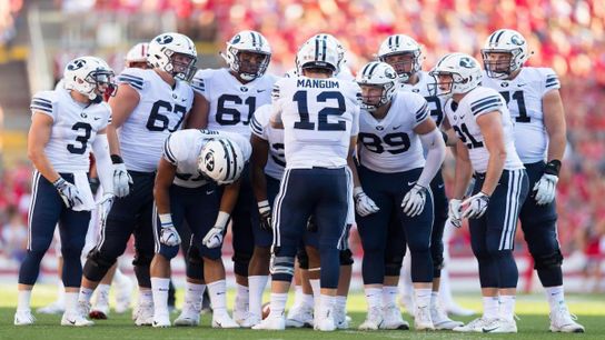
BYU alternates between navy and royal blue, and your preference may vary. (I prefer the navy.) This set, classic without being boring, is what Penn State's uniforms could be if the Nittany Lions weren't clinging to an inferior look of yesteryear.
3. Colorado
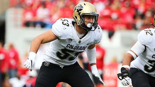
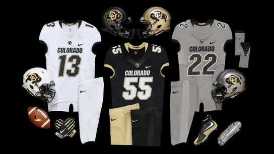
In my part-time job running a uniform consulting business I generally advise clients to stick with one helmet while mixing and matching below that, which I believe promotes variety while also preserving maximum brand identity. But I'm willing to make an exception when you've got four lids that look this good.
4. Auburn
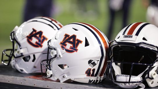
These are the best uniforms in the SEC, full stop. Just enough white to allow the blue and orange to pop, but not too much of any element, all combined into a timeless design.
5. Hawai'i
Speaking of unique color schemes, Hawai'i has black and dark green to itself at the FBS level, and boy do the Warriors know how to wear it. Hawai'i does a great job utilizing tribal markings throughout the uniform, and using the island chain as a helmet decal was a gorgeous addition. No one is going to confuse Hawai'i for anyone else so long as the Warriors dress like this.
6. Temple

Dark red is a crowded space in college sports, with team after team donning crimson or burgundy or scarlet or maroon. But Temple has cherry all too itself, and the Owls know how to wear it. The diamond pattern on the helmet stripe is a great way to stand out without trying too hard, and the tapered stripes down the pants is another unique look.
7.Appalachian State

Yellow makes another appearance, even if App, like Cal, is too bashful to admit to wearing it. The Mountaineers have done a great job in recent years of mixing yellow with their standard black, and their entire uniform portfolio -- nay, their entire university -- is stronger for it.
8. Wake Forest

Wake will sometimes swap color schemes on its helmet, but this is their best look. The solid black shell allows the gold lettering to shine. This is a better, cleaner version of what Vanderbilt attempts to accomplish with the same colors.
9. Kansas State

Chris Klieman has indicated he'll switch up K-State's look under his regime, which is a shame. The Powercat is a great college logo, and the Wildcats do a great job of mixing in juuuuust the right amount of purple.
10. Louisiana-Lafayette
The Cajuns' uniforms weren't always this pretty. Louisiana-Lafayette used to wear a more "modern" look, but the change to a classic design actually looks more contemporary, because classic looks will always be in style.
Dropping the black to go with simple vermillion and white is a perfect example of "less is more," and I love how the double stripes on the helmet ties in with the stripes on each shoulder.
11. Michigan State

Just kidding.
11. Akron

The 2019 season was a struggle for the Zips, going 0-12. But Akron at least looked good doing it, mixing and matching a standard Z helmet -- how many other schools put their nickname initial on their helmet instead of their school's? -- with the lovely kangaroo alternate you see above.
